The R class R programming for biologists
07 -- Graphics with ggplot2
To make things easier, I created a cleaned up version of the surveys dataset that we will use.
download.file("http://r-bio.github.io/data/surveys_complete.csv",
              "data/surveys_complete.csv")
surveys_complete <- read.csv(file = "data/surveys_complete.csv")
In this lesson, we will be using functions from the ggplot2 package to create plots. There are plotting capabilities that come with R, but ggplot2 provides a consistent and powerful interface that allows you to produce high quality graphics rapidly, allowing an efficient exploration of your datasets. The functions in base R have different strengths, and are useful if you are trying to draw very specific plots, in particular if they are plots that are not representation of statistical graphics.
Plotting with ggplot2
We will make the same plot using ggplot2 package.
With ggplot, plots are build step-by-step in layers. This layering system is based on the idea that statistical graphics are mapping from data to aesthetic attributes (color, shape, size) of geometric objects (points, lines, bars). The plot may also contain statistical transformations of the data, and is drawn on a specific coordinate system. Faceting can be used to generate the same plot for different subsets of the dataset.
To build a ggplot we need to:
- bind plot to a specific data frame
ggplot(surveys_complete)
- define aestetics (
aes), that maps variables in the data to axes on the plot or to plotting size, shape color, etc.,
ggplot(surveys_complete, aes(x = weight, y = hindfoot_length))
## Error: No layers in plot
- add
geoms– graphical representation of the data in the plot (points, lines, bars). To add a geom to the plot use+operator:
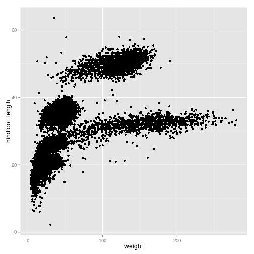
ggplot(surveys_complete, aes(x = weight, y = hindfoot_length)) +
  geom_point()

We can reduce over-plotting by adding some jitter:
ggplot(surveys_complete, aes(x = weight, y = hindfoot_length)) +
  geom_point(position = position_jitter())
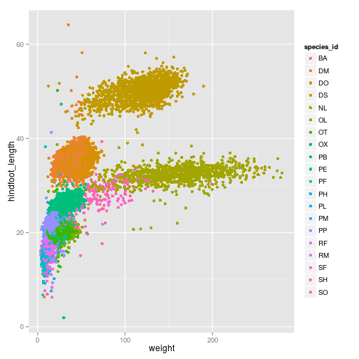
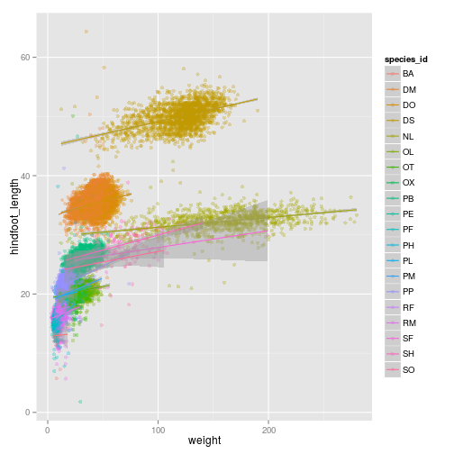
We can add additional aesthetic values according to other properties from our dataset. For instance, if we want to color points differently depending on the species.
ggplot(surveys_complete, aes(x = weight, y = hindfoot_length, colour = species_id)) +
  geom_point(position = position_jitter())
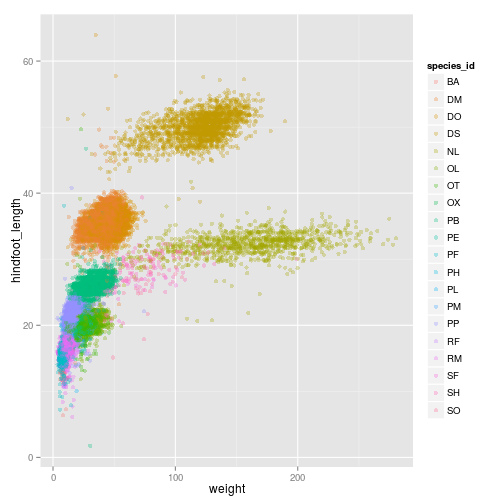
We can also change the transparency
ggplot(surveys_complete, aes(x = weight, y = hindfoot_length, colour = species_id)) +
  geom_point(alpha = 0.3,  position = position_jitter())
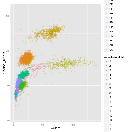
Just like we did for the species_id and the colors, we can do the same with using different shapes for
ggplot(surveys_complete, aes(x = weight, y = hindfoot_length, colour = species_id, shape = as.factor(plot_id))) +
  geom_point(alpha = 0.3,  position = position_jitter())
## Warning: The shape palette can deal with a maximum of 6 discrete values
## because more than 6 becomes difficult to discriminate; you have
## 24. Consider specifying shapes manually. if you must have them.
## Warning: Removed 21084 rows containing missing values (geom_point).
## Warning: The shape palette can deal with a maximum of 6 discrete values
## because more than 6 becomes difficult to discriminate; you have
## 24. Consider specifying shapes manually. if you must have them.
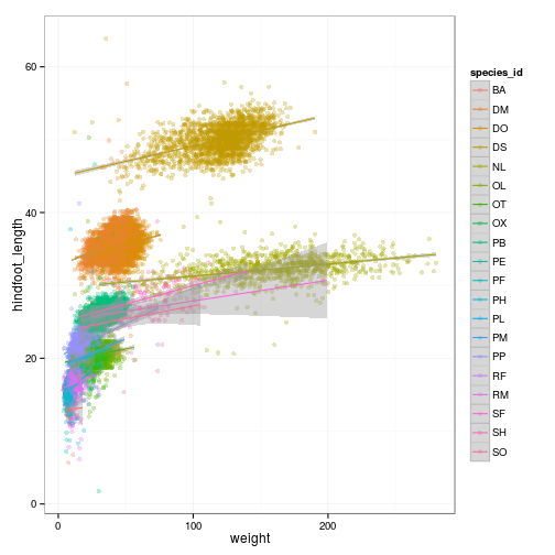
ggplot2 also allows you to calculate directly some statistical
ggplot(surveys_complete, aes(x = weight, y = hindfoot_length, colour = species_id)) +
  geom_point(alpha = 0.3,  position = position_jitter()) + stat_smooth(method = "lm")
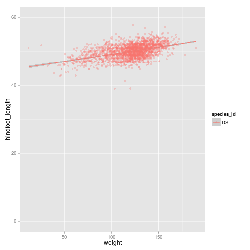
ggplot(subset(surveys_complete,  species_id == "DS"), aes(x = weight, y = hindfoot_length, colour = species_id)) +
  geom_point(alpha = 0.3,  position = position_jitter()) + stat_smooth(method = "lm")
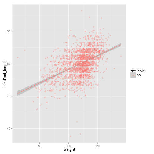
ggplot(subset(surveys_complete, species_id == "DS"),
       aes(x = weight, y = hindfoot_length, colour = species_id)) +
  geom_point(alpha = 0.3,  position = position_jitter()) + stat_smooth(method = "lm") +
  ylim(c(0, 60))
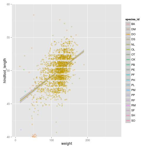
ggplot(surveys_complete,
       aes(x = weight, y = hindfoot_length, colour = species_id)) +
  geom_point(alpha = 0.3,  position = position_jitter()) + stat_smooth(method = "lm") +
  ##ylim(c(40, 60))
  coord_cartesian(ylim = c(40, 60))
ggplot(surveys_complete, aes(x = weight, y = hindfoot_length, colour = species_id)) +
  geom_point(alpha = 0.3,  position = position_jitter()) + stat_smooth(method = "lm") +
  theme_bw()
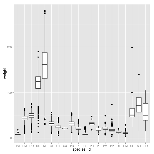
Boxplot
Visualising the distribution of weight within each species.
ggplot(surveys_complete, aes(x = species_id, y = weight)) +
  geom_boxplot()
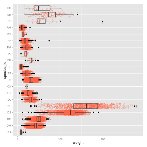
By adding points to boxplot, we can see particular measurements and the abundance of measurements.
ggplot(surveys_complete, aes(species_id, weight)) +
  geom_point(alpha=0.3, color="tomato", position = "jitter") +
  geom_boxplot(alpha=0) + coord_flip()
Challenge
Create boxplot for
hindfoot_length, and change the color of the points. Replace the boxplot by a violin plot Add the layercoord_flip()
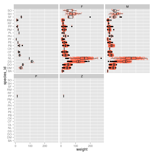
Faceting
ggplot(surveys_complete, aes(species_id, weight)) +
  geom_point(alpha=0.3, color="tomato", position = "jitter") +
  geom_boxplot(alpha=0) + coord_flip() + facet_wrap( ~ sex)
Challenge
Modify the data frame so we only look at males and females Change the colors, so points for males and females are different Change the data frame to only plot three species of your choosing
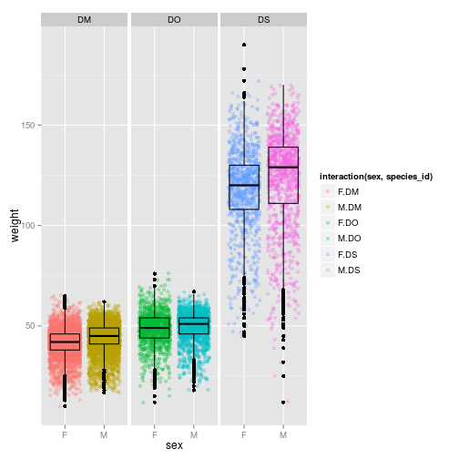
ggplot(subset(surveys_complete, species_id %in% c("DO", "DM", "DS") & sex %in% c("F", "M")),
       aes(x = sex, y = weight,  colour = interaction(sex, species_id))) + facet_wrap( ~ species_id) +
       geom_point(alpha = 0.3, position = "jitter") +
       geom_boxplot(alpha = 0, colour = "black")
barplot
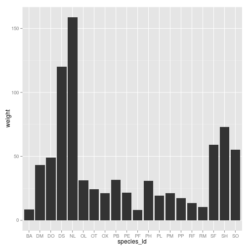
ggplot(surveys_complete, aes(species_id)) + geom_bar()

surveys_weights <- with(surveys_complete, tapply(weight, species_id, mean))
surveys_weights <- data.frame(species_id = levels(surveys_complete$species_id),
                              weight = surveys_weights)
surveys_weights <- surveys_weights[complete.cases(surveys_weights),  ]
ggplot(surveys_weights, aes(x = species_id, y = weight)) + geom_bar(stat = "identity")
Challenge
Repeat the same thing on the hindfoot length instead of the weight
Resources for going further
- The ggplot2 documentation: http://docs.ggplot2.org/
- The R cookbook website: http://www.cookbook-r.com/
- customizing the aspect of your plots with themes: http://docs.ggplot2.org/dev/vignettes/themes.html